Monochromatic Minimalist Interior Design
Interior Philosophy

Monochromatic
Minimalist
Interior Design
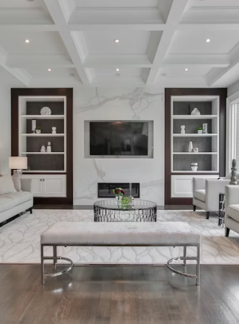
Minimalist white interior with clean lines

FIG 1.0 — PURITY

People keep asking me about monochromatic interiors. I see the appeal. One color family. Clean lines. Nothing extra.

My neighbor redid her apartment last year. Everything white. Walls, furniture, even the curtains. She showed me photos before the renovation. There were five different wood tones, three paint colors, patterned rugs. Now it's just white on white on white. She says it's calming. I believe her.

The word "monochromatic" means one color. Interior designers use it loosely. They might do all grays. Or all blues. Or all beiges. The shades can vary. Light gray sofa. Dark gray rug. Medium gray walls. Still monochromatic.
Where This Started

Minimalism in design goes back decades. Japanese architecture influenced a lot of Western designers in the 1900s. Bauhaus movement in Germany. Scandinavian design after World War II. They all emphasized simplicity. Less decoration. More function.

The monochromatic part came later. I've seen design magazines from the 1980s. Lots of minimalism. Not much monochromatic. Too much contrast. Black and white together. Red accent walls. That changed in the 1990s. Belgium had designers doing all-neutral spaces. Axel Vervoordt was one. His work looked ancient and modern at the same time. All beige and gray and ivory.

Now every design blog shows monochromatic rooms. Instagram made it worse. Or better. Depends on your view.

Abstract architectural details
Form Follows Function

Picking Your Color

Most people pick neutrals. White, beige, gray, taupe. Makes sense. Neutral backgrounds work with life. You bring home flowers. They don't clash. Your kid draws a colorful picture. You can hang it up.

I've seen monochromatic spaces in other colors. All blue. All green. All terracotta. They look dramatic in photos. Living in them might feel different. A friend tried all navy. Looked amazing for six months. Then she said it felt heavy. She painted two walls white. Not monochromatic anymore. She's happier.

Pure White
Cool Gray
Greige
Taupe

White

White is popular. Shows dirt easily. You need to clean more. Parents with young kids might want to skip white. Or accept the mess.

Gray

Gray became trendy around 2010. Every flip show on TV used gray. I got tired of it. Other people love it. Gray has warm versions and cool versions. Warm gray has beige undertones. Cool gray leans blue. Pick the wrong one and your room feels cold or dingy.

Beige

Beige is making a comeback. People called it boring for years. Now designers call it "greige" or "warm minimalism." Same color. Different marketing.

Building the Look

You start with paint. Pick your base color. Most people do walls first. Some designers say do furniture first. I think walls are easier to change than furniture. You can always repaint.

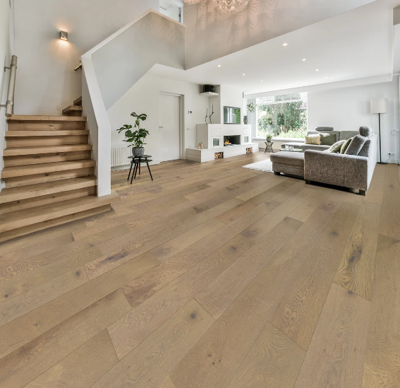
Wood floor texture in minimalist room

Texture Layering

Floors matter. Light wood floors work with light walls. Dark floors create contrast. That's not pure monochromatic. Some designers don't care. They say as long as the walls and main furniture match, you're fine.

Furniture comes next. You want different textures. All the same color gets boring. A gray linen sofa. A gray velvet chair. A gray leather ottoman. Same color family. Different feels.

Textiles add warmth. Throw blankets. Pillows. Curtains. You can stick with your color or break the rule here. I've seen all-white rooms with one rust-colored blanket. Technically not monochromatic. Looks good though.

Lighting changes everything. A beige room in morning light looks different than in evening light. Natural light shows true colors. Artificial light can make things look yellow or blue. I learned this when I painted my kitchen. Looked perfect at noon. Looked dingy at night. I changed the light bulbs. Fixed the problem.

What You Actually Need

ESSENTIALS

You don't need expensive furniture. I've seen beautiful monochromatic spaces with IKEA basics. The color scheme makes it look intentional. Rich people can buy fancy stuff. Regular people can create the look on a budget.

A few key pieces make the difference. A good sofa. Decent lighting. Window treatments that fit properly. Everything else can be cheap.

Perspective 01

Some designers say you need art. I disagree. Empty walls work in monochromatic spaces. That's the point. Emptiness. Space to breathe. You can add one piece if you want. Or twenty. Your space.

Perspective 02

Plants break the monochromatic rule. Green isn't white or gray or beige. Most people add plants anyway. Rooms without plants feel dead. I think the design police can allow one exception.

Common Mistakes

01

People make their spaces too matchy. Every single item the exact same shade. That looks flat. You need light and dark versions of your color. Depth matters.

02

The other mistake is sterile. Medical office vibes. You need texture and warmth. Wood furniture helps. Fabric helps. Metal can work if it's not too shiny.

03

Clutter destroys monochromatic design. Three things on your coffee table look intentional. Fifteen things look messy. You have to edit your stuff. Get rid of things. Or hide them in cabinets.

04

Bad lighting ruins everything. One overhead light makes shadows and looks harsh. You need multiple light sources. Floor lamps. Table lamps. Maybe under-cabinet lighting in kitchens.

Making It Work Daily

Monochromatic spaces require maintenance. Dust shows on dark surfaces. Stains show on light surfaces. You clean more. Or you live with imperfection.

Organized minimalist shelving

Storage becomes critical. All your colorful stuff needs to go somewhere. Closets. Cabinets. Boxes. I know someone who keeps all her books in another room because the covers clash with her all-white living room. That's too much for me.

Kids and pets make monochromatic design harder. Toys are colorful. Pet toys are colorful. You can get neutral versions. They cost more. You have to search for them.

Some people do one monochromatic room. The rest of the house can be normal. The bedroom works well for this. You're mostly there with eyes closed anyway.

My Take

I like the idea more than the reality. Monochromatic spaces photograph well. Living in them feels different. I tried it in my home office. All gray. Looked clean for two weeks. Then I missed color. I added yellow flowers. Then a red stapler. Then colorful book covers. Now it's not monochromatic. I don't care.

"Design is personal."

Other people commit fully. They love it. They find it peaceful. I respect that. Design is personal.

The minimalist part appeals to me more than the monochromatic part. Less stuff. More space. That makes sense. The color restriction feels arbitrary. You can have a minimalist space with color. You can have a cluttered space in all white.

Try it if you want. Start small. One room. See how it feels. You can always add color later. Paint is cheap. Furniture lasts years.